Your Pantone Doesn't Survive Contact With Soft TPR
- Share
- publisher
- PlayGoro
- Issue Time
- Oct 22,2026
Summary
Soft toy-grade TPR is translucent, thin-walled and matte, so a Pantone chip cannot simply be copied onto it. Where squishy color drift really comes from, the pigment-versus-softness tradeoff nobody warns you about, and the plaque-based approval protocol that ends color disputes.
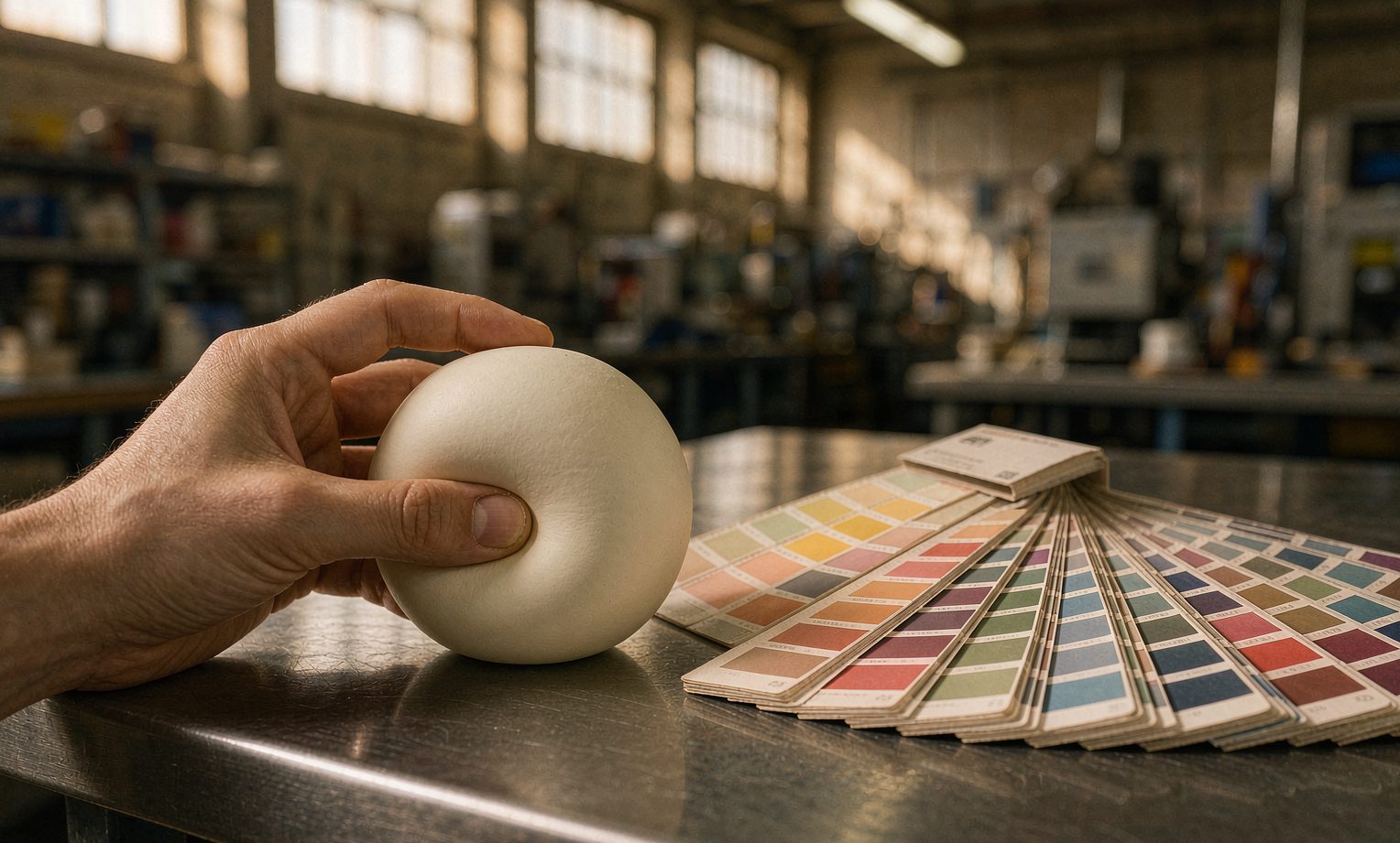
A brand sends us a Pantone number. We send back a sample. It gets approved. Three months later a container lands, the cartons open, and the color is — not wrong, exactly. Just not the color that was approved. Slightly duller. Slightly creamier. Different under the store lights than it was in the office.
Then comes the message every factory dreads: "This isn't the color we signed off on."
It usually is — on paper. The failure isn't dishonesty or sloppiness. It's that almost nobody specs color for soft, translucent, oil-extended TPR the way it must be specced, because almost nobody has been told what soft TPR does to color. We build squishies in Yiwu, color-matching is a weekly event on our floor, and this is the whole story: why a Pantone chip can't simply be "copied," where color drift actually comes from, and the approval protocol that ends these disputes before they start.
Quick answer. Soft toy-grade TPR is translucent, thin-walled, and matte — so its color depends on wall thickness, the filling behind it, and the light it's viewed under, not just the pigment. Hitting a saturated or opaque color requires pigment and titanium dioxide loading, and that loading is filler: it stiffens the compound and fights your slow-rise feel. Colors also match under daylight and split under store fluorescents (metamerism). The fix is procedural: approve color on a molded plaque of production compound and thickness, under three standard illuminants (D65, A, F11), with a numeric tolerance (ΔE ≤ 2.0, metamerism index ≤ 1.0) — and re-check white and cream after heat aging, because they yellow first.
Why a soft toy is not a rigid plastic part
Most color guidance online was written for rigid injection-molded plastic: opaque, flat, measured with a spectrophotometer, done. A soft TPR squishy breaks all three assumptions, and each break is a separate source of "it doesn't look right."
First, it's translucent. A soft TPR shell passes light. What your eye reads as "the toy's color" is pigment plus whatever light returns from behind the wall — the filling, or the air gap inside it. That makes color a function of thickness: the same compound looks paler at a thin shoulder and deeper at a thick belly. Buyers compare two toys from the same batch and see a mismatch that is actually a geometry difference. The honest fix is in the design, not the pigment: hold the wall as uniform as the sculpt allows, and choose a filling color that cooperates with the shell instead of fighting it — a dark filling under a pale shell reads as a bruise.
Second, it's soft and curved. A spectrophotometer needs flat, stable contact. Press its port onto a soft ball and you deform the surface, curve the light path, and — with translucent material — measure whatever is behind the wall. This is why we never approve color on the toy. Color is measured on a molded plaque of the same compound at production thickness; the toy's appearance is then confirmed visually against that plaque. If a supplier shows you a Delta E number measured on a curved soft toy, treat it as decorative.
Third, it's matte. Texture and gloss change perceived color, which is why measurement geometry matters. Sphere instruments (d/8) average out texture; directional ones (45/0) correlate with how a human sees it. Pick one, write it into the spec, and never let the two be compared to each other — the same plaque reads differently on each.
The trade nobody warns you about: pigment fights softness
This is the part that matters most for squishies, and the part generic color guides will never tell you.
A saturated or opaque color needs pigment — and for opacity, titanium dioxide. Pigment and mineral filler are, mechanically, filler. More of them means a stiffer compound, a shorter, snappier rebound, and a slow-rise feel drifting away from the 8-second sweet spot that makes a squishy feel alive. Meanwhile a barely-pigmented compound keeps its softness but goes translucent and washed-out.
So every color request is a negotiation with physics, and the negotiation happens at the compounding table, months before the first carton ships:
| Color type | What it demands | Cost to the feel | What we recommend |
|---|---|---|---|
| Pastels on cream base | Low pigment load | Minimal — softest feel survives | Best match for slow-rise specs |
| Deep saturated tones | High organic pigment load | Measurable stiffening; recovery drifts faster | Accept a slightly firmer feel, or a two-tone shell |
| Full opacity / light colors | Titanium dioxide loading | Stiffens; also yellows fastest with heat and UV | Decide how white "white" must be — it is a feel decision, not a color decision |
| Metallics, pearls, neons | Effect pigments or dyes | Unpredictable on soft translucent TPR | Ask for a plaque first; some colors we will decline honestly |
If your supplier has never told you that your brand color will change how the toy feels, they either haven't made the connection or they're planning to hit the color and let the rebound land where it lands. Ask which.
Metamerism: the match that only exists in your office
Two colors can be identical under one light source and visibly different under another. That's metamerism, and it is the single most common way a "perfect" approval turns into a shelf complaint. Your sample was approved under office daylight (D65). The toy then sells under warm retail LEDs or TL84 store fluorescents — and the pigment set in the plastic reflects that light differently than the paper chip you approved against. Paper and plastic never share a spectral curve, so a match against a paper Pantone chip is a coincidence waiting for the wrong light bulb.
The tolerance ladder is well established in plastics: a Delta E of 1.0 or less is essentially imperceptible; 1.0–2.0 is a slight difference you find by putting pieces side by side; 2.0–3.0 is visible at a glance; above 3.0, most industries call it a reject. Consumer plastic goods typically live between 1.0 and 2.0. For a soft toy with texture, curvature and translucency, ΔE ≤ 2.0 measured on plaques under D65 — plus a metamerism index no worse than 1.0 when re-measured under illuminant A and F11 — is a spec that holds up in the real world without demanding automotive-paint economics.
Where drift actually comes from on the floor
Approve the perfect plaque and you can still drift in production. Five sources, all controllable, all worth writing down:
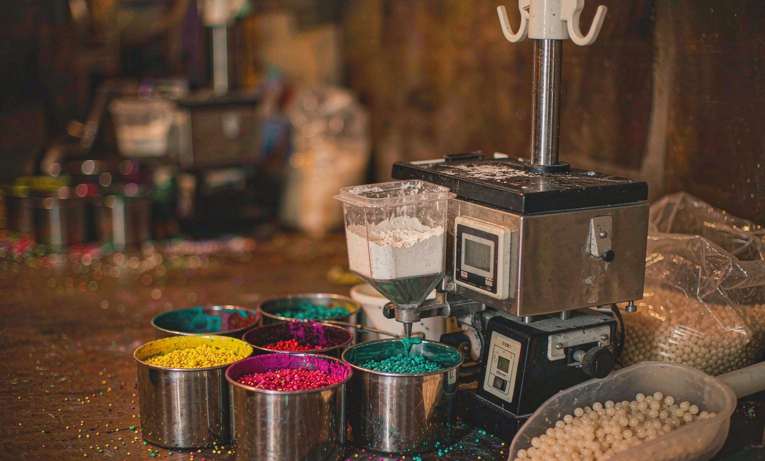
- Masterbatch let-down ratio. The dosing ratio of color concentrate to base compound is the biggest single lever. A ratio that "looks about right" instead of weighed-and-logged is how batch two becomes a different toy.
- Dispersion quality. Poorly dispersed pigment shows as streaks, speckles, or a color that reads deeper at the gate and paler at the end of flow.
- Heat history. Melt temperature and residence time degrade some pigments — the same reason whites and creams yellow. A machine running hot shifts color before it shifts anything else you'd notice.
- Regrind ratio. Regrind is economically sensible and chromatically noisy: it carries its own heat history and drags the color darker and duller as its share rises. The ratio belongs in the spec.
- Mold and texture changes. A re-polished or re-textured cavity changes surface gloss, and gloss changes perceived color — same compound, different toy.
The approval protocol that ends the argument
Everything above collapses into one procedure. It costs a lab-dip round and one plaque shipment, and it deletes an entire category of disputes:
| Step | What happens | What you receive |
|---|---|---|
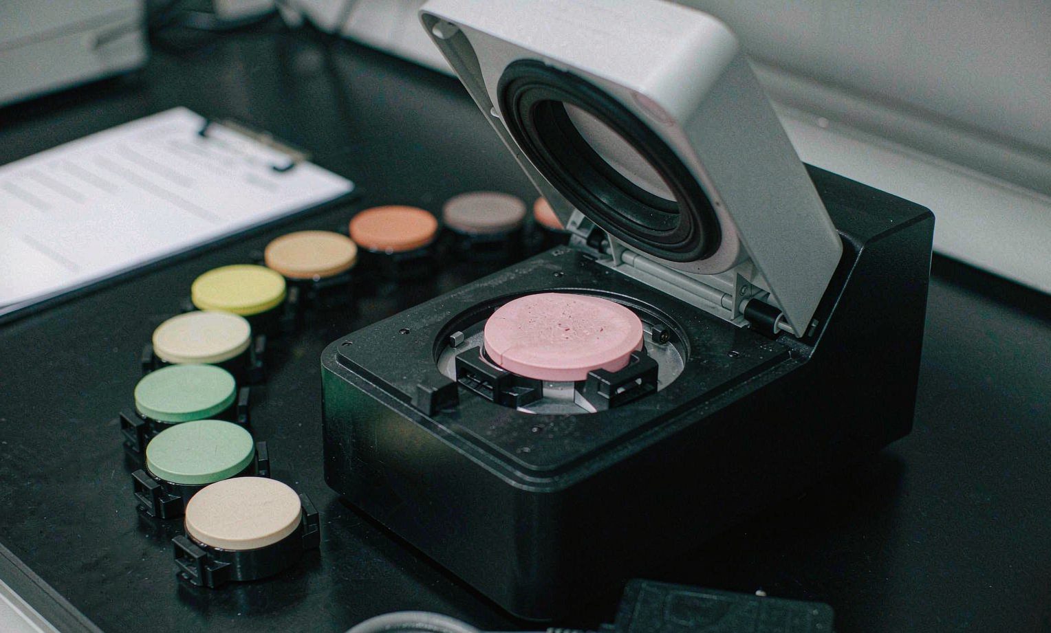
| 1. Lab plaque | Color matched on the production compound, molded at production thickness | Plaque set, by courier |
| 2. Multi-light check | Plaque and reference viewed under D65, A and F11 in a standard booth | Any visible metamerism, flagged before you commit |
| 3. Numeric pass | Spectrophotometer, agreed geometry, 10° observer | ΔE ≤ 2.0 vs. reference; metamerism index ≤ 1.0 |
| 4. Feel check | Recovery time measured on the pigmented compound | Written confirmation the color did not buy its brightness with your slow-rise feel |
| 5. Golden sample | Signed plaque sealed and kept by both sides | The reference every future batch is judged against |
| 6. Aging re-check | Plaque after 7-day 50°C heat-age, yellowness index tracked | Proof whites and creams stay white — or an honest warning that they won't |
Five lines worth writing into the PO
- Reference: color approved on molded plaque (golden sample), not on paper chips, not on screens.
- Tolerance: ΔE ≤ 2.0 (CIE Lab, agreed instrument geometry, 10° observer) versus the golden sample.
- Lighting: pass under D65; metamerism index ≤ 1.0 under illuminants A and F11.
- Process: masterbatch let-down ratio and regrind percentage fixed in writing; new material lots trigger a first-article color check.
- Aging: for whites and creams, yellowness index re-measured after heat aging, with an agreed limit.
Notice what "match Pantone 485-C" alone contains: no substrate, no thickness, no light source, no tolerance, no measurement method. A clause that vague is not a spec — it is a discount negotiation scheduled in advance.
What we will honestly say no to
Some color requests fail physics, not effort. Exact metallics and pearls on a soft translucent shell never look like the metallic swatch — the effect pigments need opacity and flatness a squishy doesn't have. Ultra-saturated neons demand pigment loads that visibly stiffen the compound, so you trade the feel the product exists for. And a "pure bright white" that also ships through a summer container is a promise about chemistry, not effort — we will tell you the realistic ceiling instead of approving a sample we can't reproduce in July. We would rather lose the color argument now than win the order and lose the reorders.
Next step. Send us your Pantone number (or a physical reference), the shell design, and the filling color you have in mind. We'll mold a lab plaque on the production compound, run it through the multi-light and feel checks, and courier the plaque set to you — before any tooling money moves. Request a color plaque, browse our wholesale squishy toys, or read how our OEM/ODM squishy manufacturing service runs from artwork to shelf. If you want the feel side of the same conversation, start with sourcing slow-rise squishies that pass QC and how to read a squishy sample.
Frequently asked questions
Can you match a Pantone exactly on a soft TPR squishy?
No factory can match a paper Pantone chip exactly on a translucent, thin-walled, matte soft material — the substrate changes the color. What we can do is match the appearance on a molded plaque of your actual compound within ΔE 2.0, under the three lights your product will actually be sold under. That is the only version of "exact" that survives contact with physics.
Why does the same toy look different colors at the shoulder and the belly?
Translucency. Light passes through the thin wall, reflects off the filling or the inner surface, and returns — so apparent color scales with wall thickness. Uniform wall design and a cooperating filling color reduce it; pigment alone cannot fix it.
Does a darker color make the squishy firmer?
Usually, yes, measurably. Reaching deep saturation or opacity needs more pigment and often titanium dioxide, and that loading acts as filler in the compound. The effect is manageable, but it is real — which is why recovery time must be re-measured on the pigmented compound, not assumed from a natural-color sample.
Why did our white squishies look creamier after one season?
Whites and creams show yellowing first: heat, UV and antioxidant depletion push the yellowness index up, and there is no pigment left to hide behind because white needs high titanium dioxide loading to look white in the first place. This is why the aging re-check exists — and why "pure white through a tropical summer" deserves an honest conversation before the PO, not after the container.
References
- 3nh / Colorimeter.com, "Complete Guide to Plastic Color Difference Control" — ΔE tolerance bands for plastics (≤1.0 tight, 1.0–2.0 acceptable, >3.0 visible). colorimeter.com
- Zhongxi Testing, "Plastic Color Difference Comparison Testing" — measurement geometry (d/8 vs 45/0), 10° observer, metamerism index, ASTM D2244 / E313 / D6290, ISO 3668 viewing conditions. en-bh.zhongxitesting.com
- Kanani Pigment, "Color Matching with Pigments: Workflow Guide" — lab-match workflow, ΔE ≤ 1.0 premium / ≤ 2.0 standard, multi-illuminant metamerism validation. kananipigment.com
- Mann & Co., "Metamerism Nightmare" — why matches approved under D50/D65 fail under retail LED/TL84; multi-illuminant booth practice. mann-co.com
- Huansu Chemical, plastic color-difference tolerance grades by application (consumer plastics and toys commonly ≤ 2.0–2.5). huansujt.com